Surface components
When building a surface, you can drag and drop different components to your surface. Different components are available for different surface types.
The following table shows for which surface types a component is available.
| Component | Touch screen | Media Display | Positional display | Ticket |
|---|---|---|---|---|
| Background | Yes | Yes | Yes | No |
| Button | Yes | No | No | No |
| Extended button | Yes | No | No | No |
| Text | Yes | Yes | Yes | Yes |
| Image | Yes | Yes | Yes | Yes |
| Vertical message | Yes | Yes | Yes | Yes |
| Link | Yes | No | No | No |
| URL | Yes | No | No | No |
| Channel Player | No | Yes | Yes | No |
| Widget | Yes | Yes | Yes | No |
| Barcode | No | No | No | No |
| System information | No | No | No | No |
Button and extended button component
The button and extended button are virtual buttons that you can add to touch surfaces. They can be linked to a services, in which case a visit is created in the system when the button is pressed. They can also just link to another page.
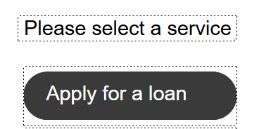
The extended button is used when you want a button with several lines of text. Since each button has a permanent unique id, such as button_extended_0, it is possible to dynamically set the text content of the button via a widget. This facilitates the use of different languages etc. To update text in buttons from a widget, in this example for extended button with id button_extended_0, update the following:
$(window.parent.document.getElementById('button_extended_0')).find('.text_single_element').text('First row');
$(window.parent.document.getElementById('button_extended_0')).find('.text_element_2').text('Second row');
$(window.parent.document.getElementById('button_extended_0')).find('.text_element_3').text('Third row');
The button and extended button component have the following settings:
| Name | Description |
|---|---|
| Service | The service to connect the button to (optional). |
| Text | The text that should be displayed on the button. If the button is connected to a service, there is an Override check box. If it is checked, it is possible to enter your own text for the service button. If unchecked, the external service name is used. |
| Screen reader text | The text that the user will hear when navigating to the button if a screen reader is enabled. This requires certain devices of Qmatic certified hardware and the ADA keypad option. |
| Image | Image for the button (a default one is available, but it is possible to select another image of your choice). Accepted formats are: jpg, jpeg, png and bmp. We recommend images with a transparent background. |
| Link to page | The page to link the button to. |
| Text color | Button text color. |
| Text position | Button text position (top and left). |
| Font | Button text font (default is Arial). |
| Align | Button text alignment (Left, Right, Center or Justify.) |
| Background color | Color of the background area of the button. |
| Keep image aspect ratio | If this check box is checked, the width and height of the image, i.e. the relative horizontal and vertical sizes, are kept. For example, if a graphic has an aspect ratio of 2:1, it means that the width is twice as large as the height. When resizing graphics, it is important to maintain the aspect ratio to avoid stretching the graphic out of proportion. |
| Image scaling | How the image should scale (Center, Fill, Fit, or Stretch). |
| Text 2 / Text 3 | Here you can edit the settings for the text on row 2 and 3 of the extended button. You can change the Text, Text color, Text position (Top, and Left), Font and how the text should be aligned (Left, Right, Center, or Justified). |
Text component
The Text component is used to add plain text to the surface.
The text component has the following settings:
| Name | Description |
|---|---|
| Text | Text to display. |
| Screen reader text | The text that the user will hear when navigating to the text if a screen reader is enabled. This requires certain devices of Qmatic certified hardware and the ADA keypad option. |
| Text color | Text color |
| Font | Text font (default is Arial). |
| Align | Text alignment (Left, Right, Center or Justify). |
| Background color | Background color of the text area |
Image
You can upload images to you surface. Accepted image formats are: jpg, jpeg, png and bmp. We recommend images with a transparent background.

For ticket layouts, it is only possible to add monochrome bitmap (bmp) pictures.
The image component has the following settings:
| Name | Description |
|---|---|
| Image | Upload an image by clicking Edit. |
| Keep image aspect ratio | If this check box is checked, the width and height of the image, i.e. the relative horizontal and vertical sizes, are kept. For example, if a graphic has an aspect ratio of 2:1, it means that the width is twice as large as the height. When resizing graphics, it is important to maintain the aspect ratio to avoid stretching the graphic out of proportion. |
| Image scaling | How the image should scale (Center, Fill, Fit, or Stretch). |
Vertical Message component
The Vertical Message component inserts an area for vertical messages, which are managed in the Context Marketing application.
For a good graphical result, the size of the vertical message area should correspond well to the size of the picture that is to be used in the Context Marketing application. The size of the vertical message area is adjusted in the bottom left area of the Surface Editor window (as with all other components):
The Vertical Message component has the following settings:
| Name | Description |
|---|---|
| Background color | Background color of the vertical message area |
| Time to show | The length of time that the vertical message should be shown. If the field is left empty, the vertical message is not removed. |
Link
Links are used to link to another page of the surface without using a button.

The link component has the following settings:
| Name | Description |
|---|---|
| Text | Text to display for link |
| Screen reader text | The text that the user will hear when navigating to the text if a screen reader is enabled. This requires certain devices of Qmatic certified hardware and the ADA keypad option. |
| Link to page | Page to link to |
| Text color | Link text color |
| Font | Text font (default is Arial). |
| Background color | Background color of the link area |
URL
The URL component is used to show a part of a web page on a touch screen. It has the following settings:
| Name | Description |
|---|---|
| URL | The URL of the wanted web page. |
Channel Player
The Channel Player component is used for creating an area where your playlists are displayed.
For a good graphical result, the size of the channel player area should correspond well to the size of the video, link or image that is to be used in the Context Marketing application.
The channel player component has the following settings:
| Name | Description |
|---|---|
| Keep image aspect ratio | If this check box is checked, then the width and height of the video, i.e the relative horizontal and vertical sizes, are kept. For example, if a video has an aspect ratio of 2:1, it means that the width is twice as large as the height. |
| Muted | If checked, any video with sound in the playlist is muted. |
Widget
Widgets are small web applications that can be added to surfaces, They can do a wide range of things, such as display previously called tickets, play a sound when a customer is called or allow customers to check in on kiosks.
Which settings are available depend on which widget you have selected.
Barcode
You can add a barcode with some kind of system information to your tickets. In the example below, it is used to add a QR code with a link to Mobile Ticket.
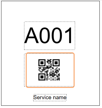
The barcode component has the following settings:
| Name | Description |
|---|---|
| Barcode type | Options: Interleaved 2/5, ITF-14, Code 39, Code 128, EAN 13 code, DataMatrix (square), DataMatrix (rectangular), and QR Code |
| System information | System information to use for the barcode. Options: Custom parameter, Current time, Ticket id, Service name, Mobile Ticket URL, or Current date. If you select Custom parameter, you must enter a valid custom parameter name string in the field below. |
| Customer parameter name | Used when Custom parameter is selected as system information. Device parameter strings are defined in the unit type template of the applicable printer. Example: The string ticketCount is used for Tickets left. |
| Calculate barcode checksum | Controls whether or not to use barcode checksum calculation. |
System information
You can display system information in text.
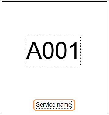
The system information component has the following settings:
| Name | Description |
|---|---|
| System information | System information to use for the barcode. Options: Custom parameter, Current time, Ticket id, Service name, Mobile Ticket URL, or Current date. If you select Custom parameter,, you must enter a valid custom parameter name string in the field below. |
| Custom parameter name | Used when Custom parameter is selected as system information. Device parameter strings are defined in the unit type template of the applicable printer. Example: The string ticketCount is used for Tickets left. |
| Font | Text font (default is Arial). |
| Align | Text alignment (Left, Right, Center or Justify). |
| Rotation | Text rotation (0, 90, 180 or 270 degrees) |
| Maximum rows | How many rows the text maximum may stretch over. This is especially useful, if you have very long service names, Branch names, or other custom system information. if you select maximum 1 rows, the text will shrink to fit within the maximum allowed width. It will however never be smaller than 6pt. If you select maximum 2 or 3 rows, long text is rendered on multiple lines and the overflow is cropped. |
| Preview text | Enter some example system information. When you save and preview your ticket, you can check how the text looks. |